Branding Great Grapes

Transforming the Cadence brand, motivated by the launch of their Cara Mia Vineyard estate wines and the expansion of their entry-level Coda.

Project

Slide background
Slide background
Slide background
Slide background
Slide background
Slide background
Slide background
Slide background
Slide background
Slide background

LABELS, BARRELS, SIGNAGE, COLLATERAL AND SALES KITS.

  • Client:

    Cadence Winery
  • Audience:

    Discerning Wine Enthusiasts and Retailers

  • Mediums:

    Branding, Packaging, Labels, Ads, Newsletters, Sales Kits and Photography

Michael provides so much more than deep design and production experience – he also has superb marketing intuition and savvy. As for Michael's palate, well, that's going to take some work...
Benjamin Smith, Winemaker

Ben and Gaye are veterans of the Washington wine movement and masters at producing beautiful Bordeaux style wines from Red Mountain. Unpretentious, they look only to make high-quality products meeting exceptionally strict tasting and aging profiles, and their brand needed to reflect their unassuming approach toward winemaking.

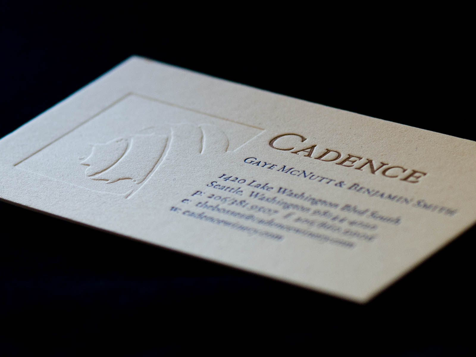
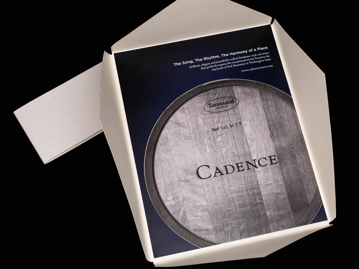
  • Their first decade saw an expansion of their product lines, increasingly high regard among serious wine aficionados and critics, and the planting, harvest, and pressing of grapes from their own vineyard. This first release of their Cara Mia Vineyard wines seemed the right time to retool their packaging and began with the development of a new mark. Rebranding the company then extended to letterpress business materials, wine list communications and eventually trickled down to winery related products (like bike jackets for Team Cadence).

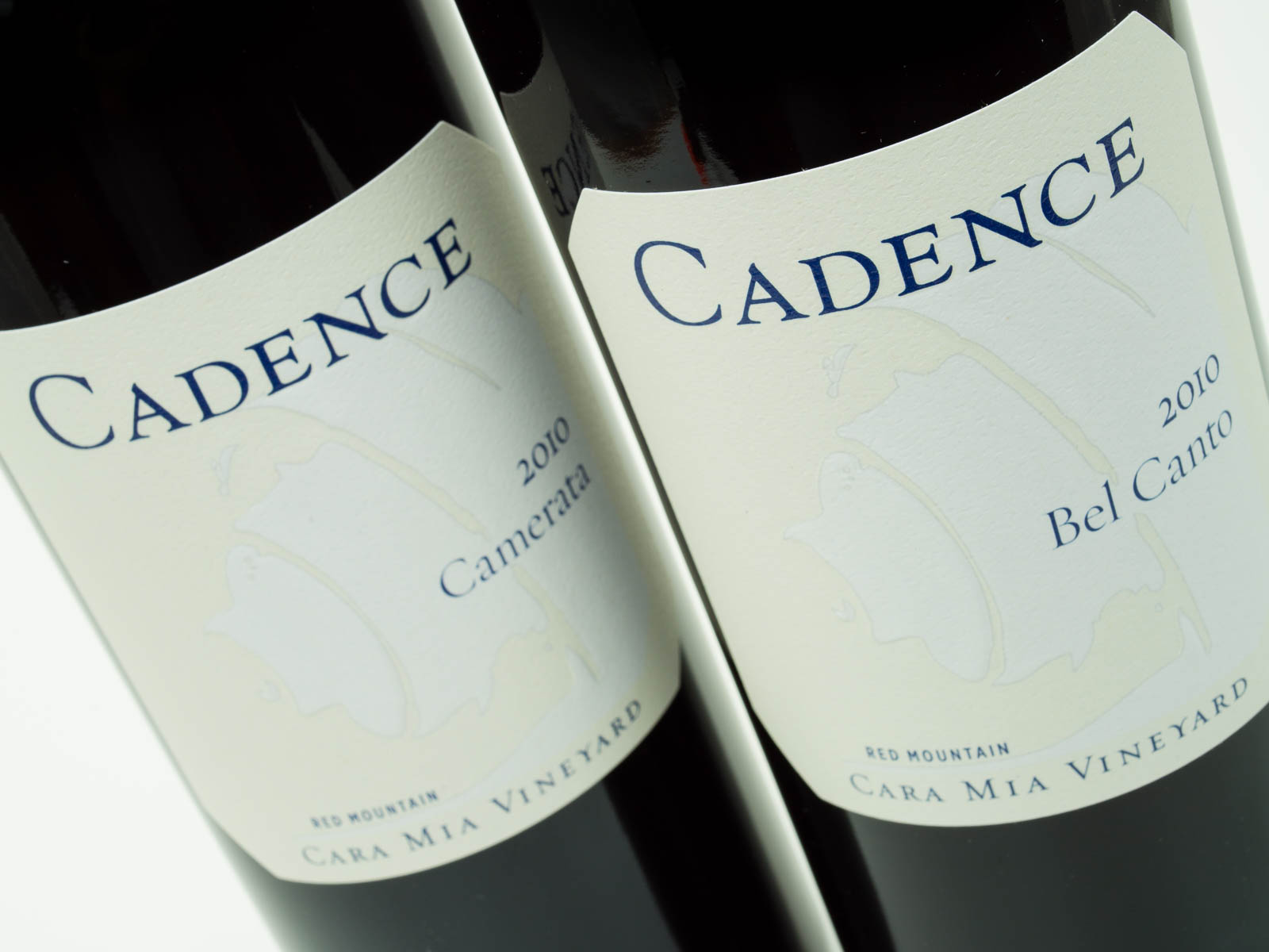
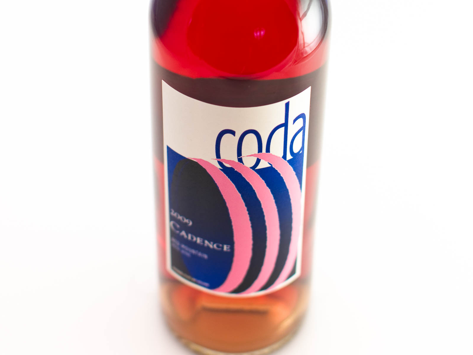
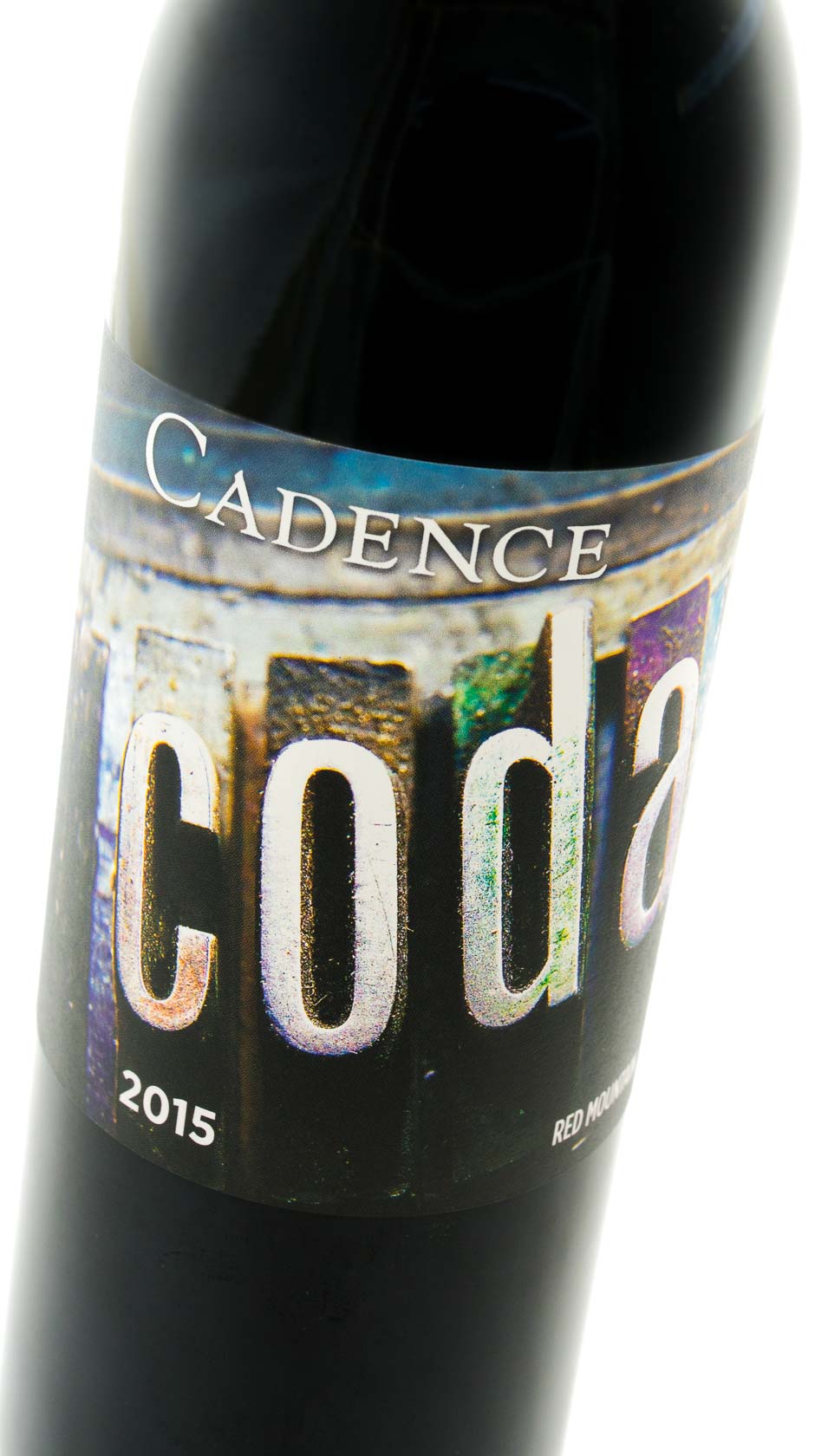
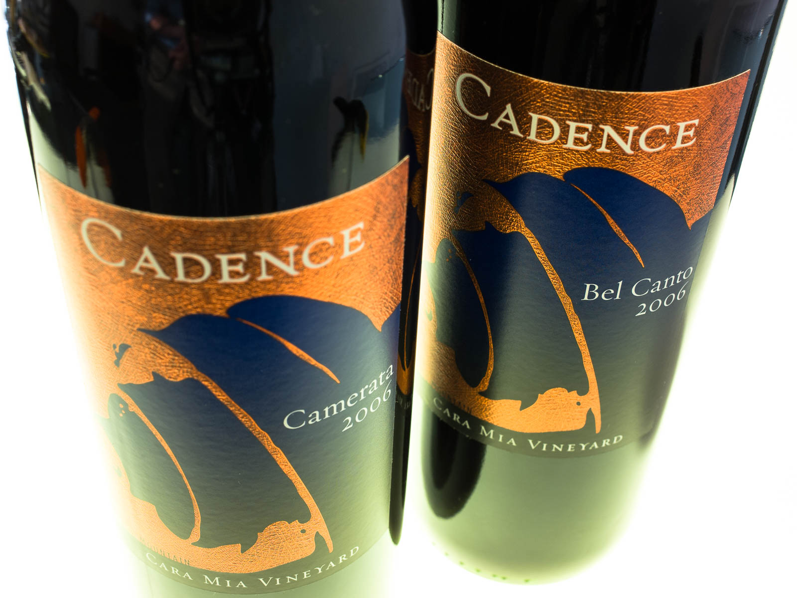
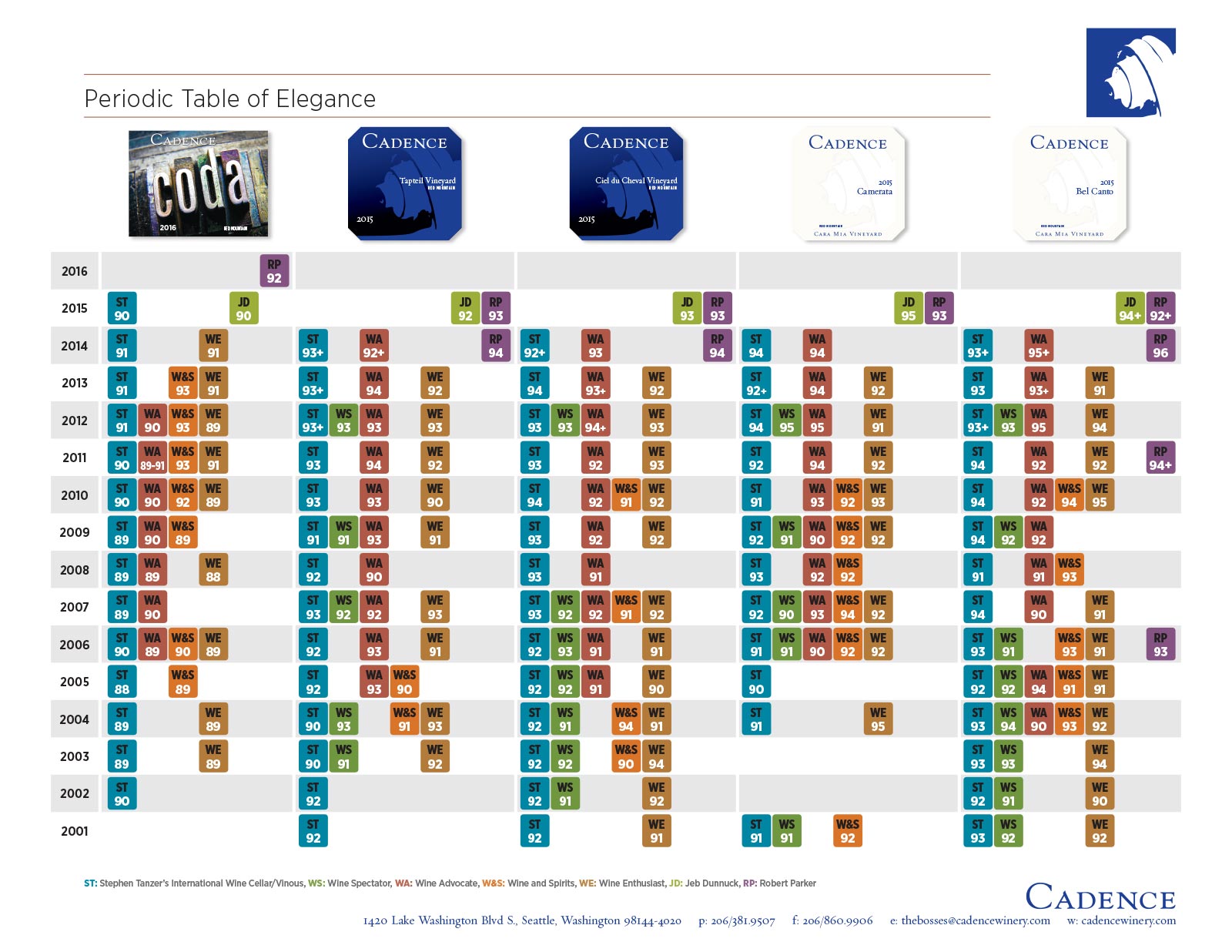
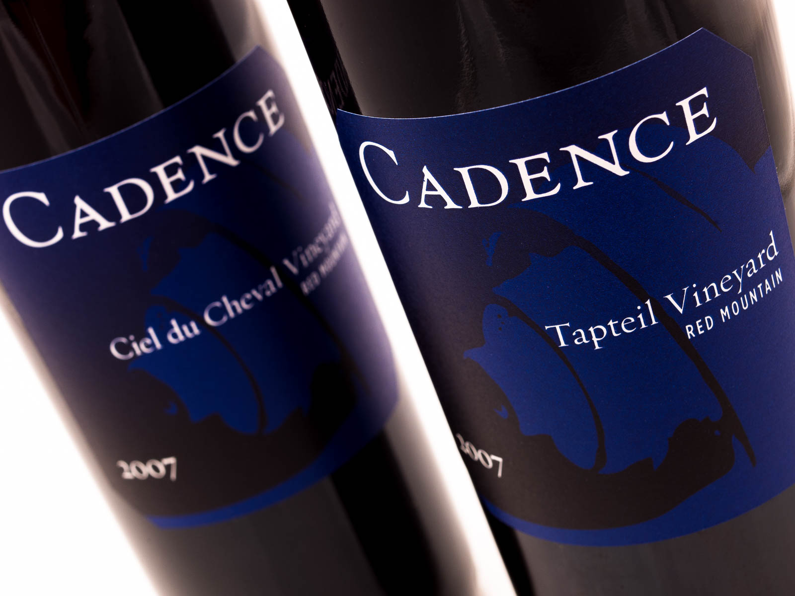
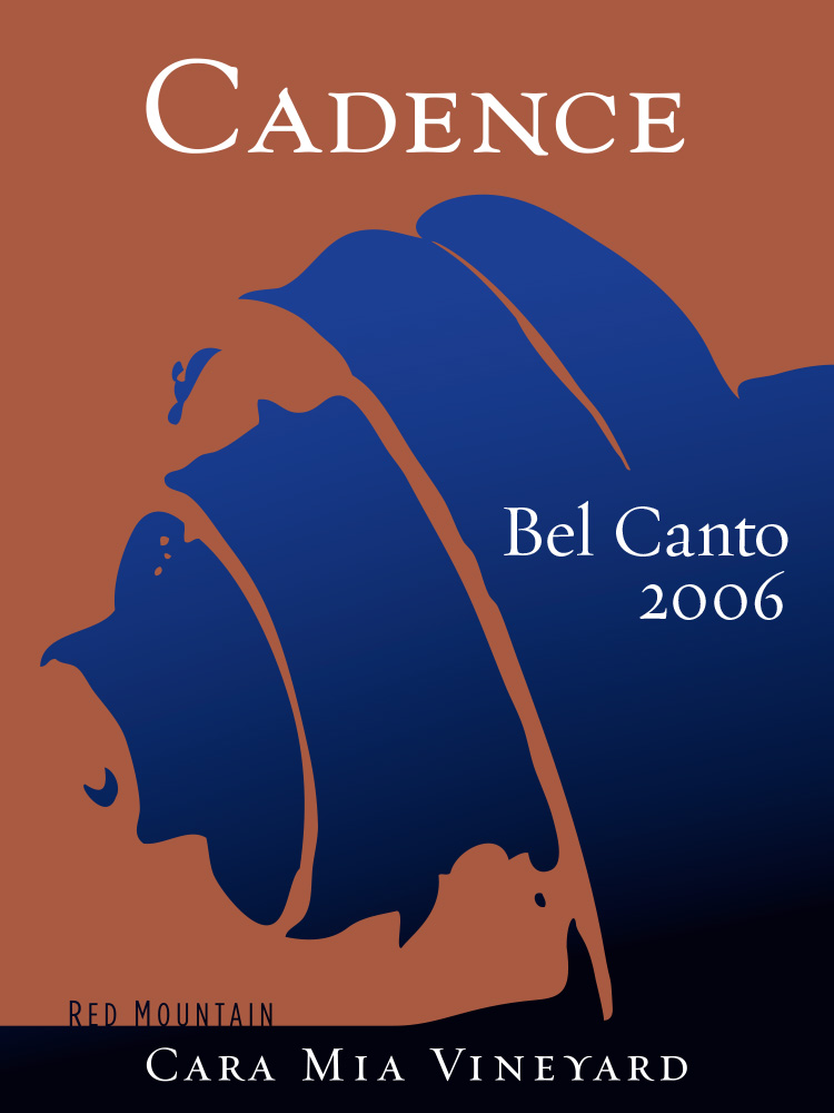
    The second decade earned consistently stellar scores and a broader reach of loyalists, looking for long-term cellared wines. All of the labels were fine-tuned to form more cohesive sets — reserves in white with the Cadence scroll deeply embossed, the vineyard wines in the traditional blue/black scheme, and Coda in a wraparound label with 10pt letterpress characters completing the message.

Slide background
Slide background
Slide background
Slide background
Slide background
Slide background

Purpose

Before developing a common motif to build the company's brand around, we took a clinical look at their history, projections of where they'd like to be in 5-10 years, their relationship with wine media and loyal customers, and most importantly, themes close to the owners. Ben and Gaye are musical (huge fans of Classical) and crazy about biking, the visual metaphors we played with tended to revolve around strings, instrumentation, motion (playing off a literal 'cadence'). We finally resolved on a violin scroll as the best visual representation, and metaphorically appropriate since it's the tuning part of the instrument (plus it's beautiful).

Labels for the 2015 vintage of Cadence reserve and vineyard wines, using the central image of the violin scroll from the Cadence branding.

Approach

Packaging retail products are similar to designing posters, each label conveys an immediate graphic impression and then has to impart varying pieces of hierarchical information. The goal is always to keep visual emotions running high and close to the company message while having text and secondary graphic elements support that initial visual pop and fill in the technical side.

Result

A prestige winery is branded from labels to cartons to sales kits to advertising to (even) bike jackets and coasters.